Designing a Brand Where Imagination Leads the Way
Chalk House of Children was more than a branding project—it was a chance to craft a world from a child’s perspective. Rooted in the Montessori philosophy, this early education center needed a brand system that felt warm, intentional, and imaginative.
My role?
To design a brand and experience that spoke to kids, reassured parents, and felt like play every step of the way.
This was about designing a product ecosystem—where every brand touchpoint was built around user empathy and curiosity-driven interaction.
Audience Empathy as a Design Principle
We discovered that our primary users were working moms looking for safety, playfulness, and creativity in their child's day-to-day. This insight shaped our communication:
Messaging was clean, empathetic, and value-forward
Brand visuals emphasized trust and care over flashiness
Even social posts were crafted as if parents were reading bedtime stories through Instagram


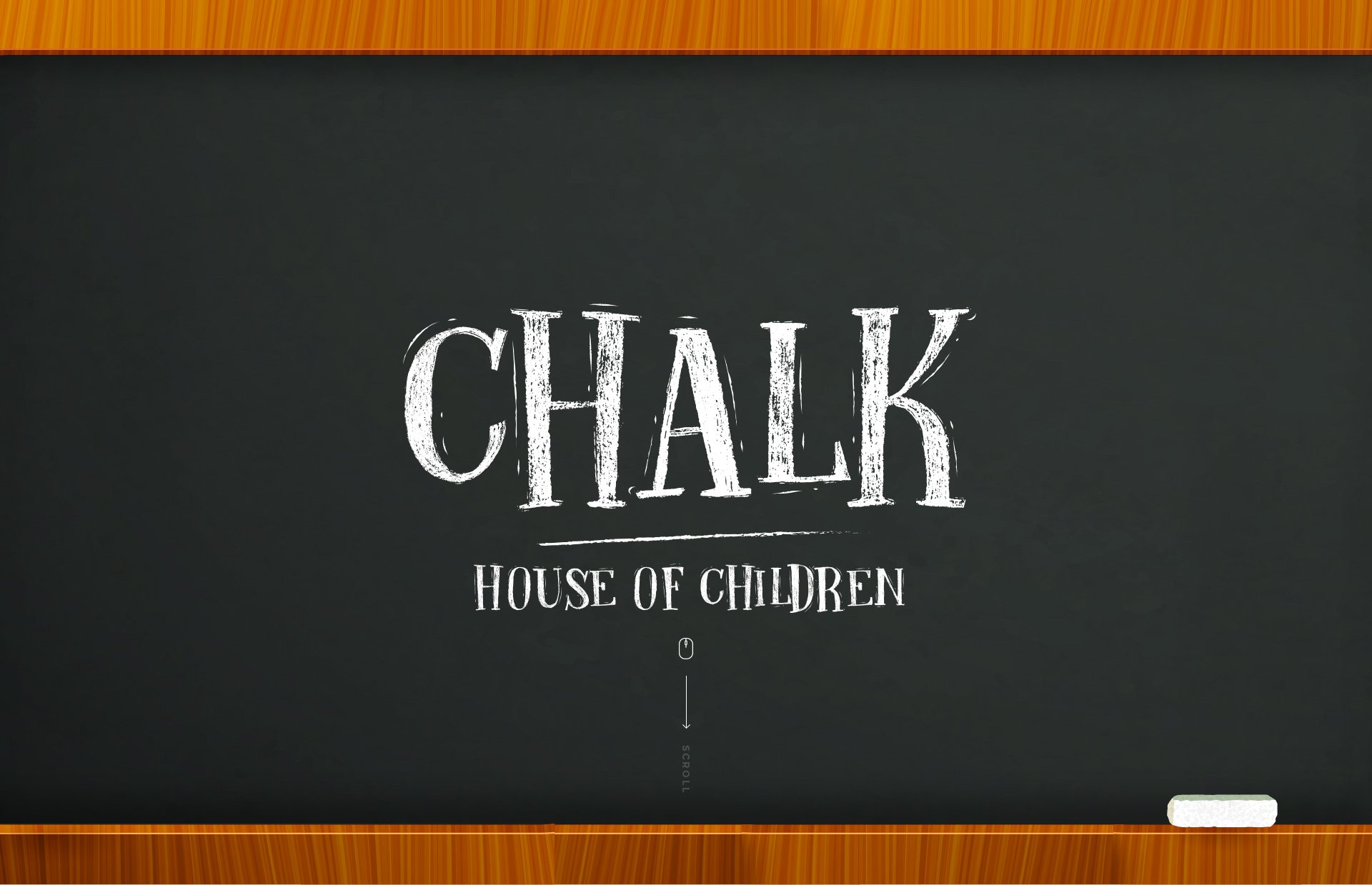
Logo System Design
I approached the logo as a modular design asset that could scale across mediums.
Concepts explored:
Slate & Chalk — as an analog metaphor for creativity
Abacus on Blackboard — nodding to foundational learning with a modern twist
The word “CHALK” in hand-rendered style — to feel raw, playful, and real
The final lockup was responsive:
Logo + icon for brand impact
Simplified monochrome versions for small-scale use
A square format that mirrored chalkboard dimensions—consistency meets function.


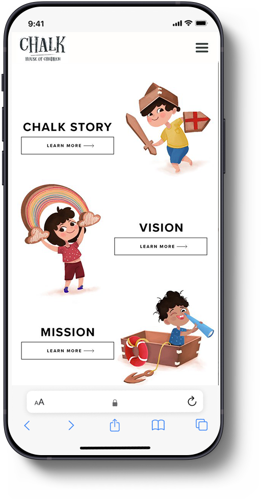
Illustrations
Children of Chalk
At Chalk House of Children, we illustrated a world where imagination leads. Children transformed cardboard boxes into rockets and ships—capturing the magic of open-ended play. These visuals weren’t just whimsical; they were intentional design choices that championed creativity, sustainability, and the power of everyday materials to inspire bold adventures and mindful habits.


For the website experience, I took a motion-first design approach:
An intro animation mimicked a teacher writing “Chalk House of Children” on a blackboard—layering auditory cues + motion for an emotionally resonant first impression.


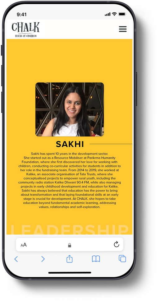
The design was fully responsive, with UI built for scroll-based discovery, accessible navigation, and delightful interactions (think color shifts and icon micro-states).


Social & Brand Touchpoints
I developed a consistent visual identity system across all social and offline platforms:
Used Chalk Yellow as a visual anchor across stories, reels, and templates
Icons and motifs stayed consistent—almost like a design system for social
We preserved the integrity of the experience even with child privacy in mind—faces hidden, moments still captured


What I Took Away
This was an exercise in designing from the heart without losing strategic structure. It taught me:
How to bridge product thinking with brand emotion
How even a pre-school can benefit from scalable design systems
That the best design is felt, not just seen
Though the school closed during the pandemic, the work lives on—and I’d do it all again for any project that blends curiosity, care, and childlike joy.