A Gyro Game That Turned Car Exploration Into an Interactive Ride
Kia was launching its latest innovation, the Carens, into a cluttered digital market. They needed more than a traditional ad—they wanted to showcase the car’s design and features in a way that actually made people stop, engage, and remember.
My brief?
“Create a mobile-first experience that felt immersive, modern, and fun—while driving awareness, product consideration, and social buzz.”

The Idea: Explore the Car, By Moving Your Phone
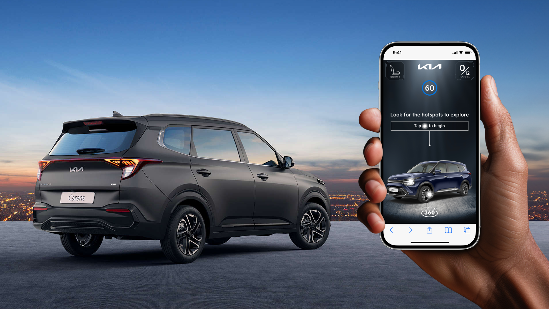
I turned a phone into a virtual showroom.
Users tilted and rotated their phones to get a 360-degree tour of the Kia Carens, inside and out.
A selfie prompt popped up at the end, inviting users to snap and share their “time with the Carens” using the campaign hashtag.
Behind the scenes, we enabled tracking codes to measure engagement and connect users to follow-up offers.
Reaching the Right Audience

I targeted high-intent users across major Indian metros using InMobi’s audience signals—reaching:
Auto enthusiasts
News readers
Users of car comparison apps
Ages 25–45, active on social and ready to buy
Design was optimised for Android (the dominant OS in India) and social app behaviour, so everything from touchpoints to selfie prompts felt native and frictionless.


A Peek Under the Hood
To bring the gyro game to life, I mapped a quick wireframe to lay out the full user journey—from swipe-in to selfie share.
The goal? Keep it smooth, interactive, and fun.
Start: A dynamic banner pulls users into the experience, no app required.
Explore: Tilt-based control lets users check out the Carens inside and out, with tap-to-learn hotspots.
Snap: The experience ends with a branded selfie moment—camera permission flows built in.
Wrap: Final screen invites users to replay or click through to the Kia site.
The wireframe helped align motion, logic, and UI structure early on—so when it launched, it just worked.

UX Details That Drove Engagement
Gyro control = tactile fun, not passive viewing
Selfie flow = reward without disrupting experience
Clean UI = spotlighted features without info overload
Hashtag integration = made sharing feel purposeful, not forced
It wasn’t just a game—it was a micro-interaction with a macro impact.
Results That Moved the Needle
Higher engagement time than standard mobile ads
Selfie shares boosted organic brand exposure
Trackable codes enabled user-level analytics and retargeting
Campaign featured in InMobi’s case study and won multiple MMA Awards


Takeaway
This wasn’t about gamification for the sake of it. It was about creating a product-like experience inside an ad format—where interaction, design, and storytelling worked together to build brand love.
“When people enjoy the ad as much as the product, you know you’re doing something right.”